From Calligraphy to Typeface: Cultural Shifts in Translating Vertical Texts
For most of human history, written language wasn't confined to horizontal formats. Across East Asia and in several classical writing traditions worldwide, the vertical orientation of text was once the dominant way of reading and writing. Yet in a globalized world where digital screens, Latin-based typefaces, and standardized formatting shape daily communication, vertical scripts have experienced profound cultural and technological shifts. These changes have affected not only how texts are presented, but how translators interpret and adapt them for modern readers as well.
Understanding these shifts is essential for anyone who works with languages, cultural materials, or international publishing. In particular, translating vertical texts has become a specialized skill that blends artistry, cultural understanding, and technical expertise. The move from calligraphy to typeface didn't simply change the way characters look, as it reshaped the emotional, philosophical, and aesthetic identity of vertical writing itself.
This article explores how vertical writing evolved from brush-based calligraphy to structured typography, why these changes matter in translation, and what cultural nuances must be preserved to keep the essence of vertical texts alive.
Vertical Writing Began as an Art Form, Not a Layout Choice
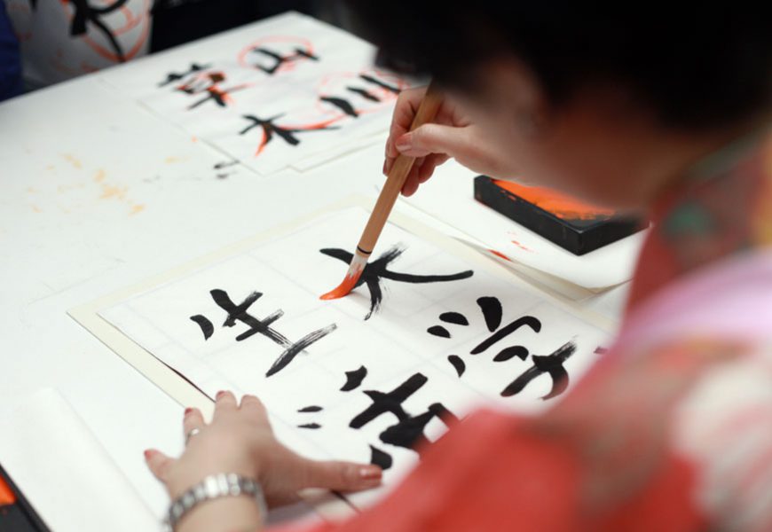
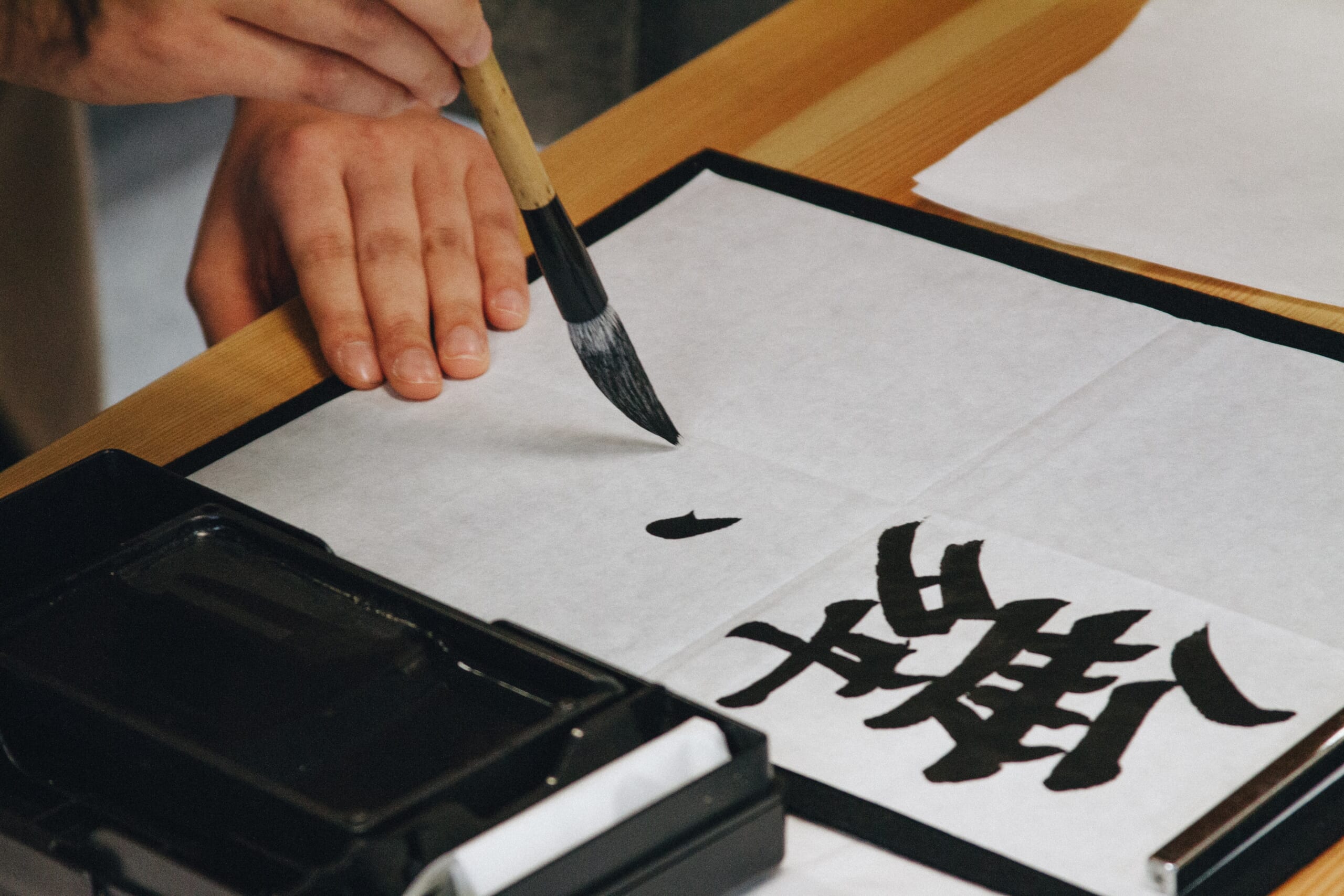
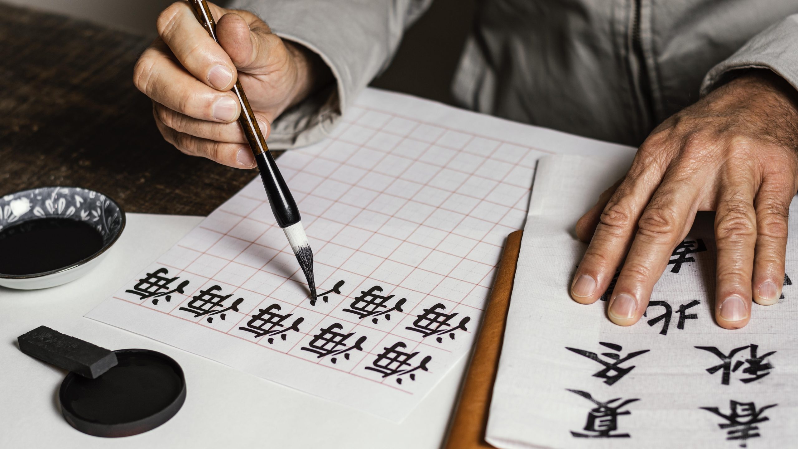
Long before horizontal formats became standard in global communication, vertical writing emerged naturally from classical tools and cultural philosophy. In Chinese, Japanese, and Korean traditions, brush calligraphy was a deeply symbolic practice. Writing downward from top to bottom mirrored the natural movement of the wrist and the flow of ink on traditional rice paper or silk.
Meanwhile, calligraphy wasn't merely a technique to relay information. It was a meditative act rooted in harmony, balance, and rhythm. Every brushstroke carried meaning:
- The speed of the stroke reflected emotional intensity.
- The weight of the ink represented mood and intent.
- The spacing between characters was a form of visual storytelling.
- The vertical structure reinforced continuity and spiritual alignment.
When translators engage with classical works written vertically, they are not just interpreting words. They are interpreting performances. A calligraphic poem or philosophical treatise contains layers of aesthetic and cultural nuance that cannot be separated from the vertical format in which it was originally experienced. This is why translating vertical texts often requires understanding not just the language, but the visual and symbolic meaning behind the writing system in line.
Typeface Standardization Brought Uniformity and Cultural Flattening
The invention of printing presses, and later the dominance of digital devices, shifted vertical writing from spontaneous brushwork to standardized typography. With movable type came the need for consistent characters. Fonts like Mincho, Gothic, and Songti transformed hand-crafted strokes into structured lines and predictable shapes.
While typography improved readability and reproduction, it also removed elements of personality inherent in calligraphy. Brush-written texts carried the writer's individuality; their breathing rhythm, emotional tone, and physical gesture. Typeface, by contrast, introduced uniformity.
This shift has a direct impact on translation. When a translator receives a vertical classical manuscript, they must decide:
- Should the translated version preserve the artistic spirit of calligraphy?
- Should it adopt a clean, modern typeface for legibility?
- Should the orientation be kept vertical, or converted into a horizontal layout?
Every choice affects how readers experience the text. For instance, a vertical poem rendered horizontally in a modern font may lose some of its contemplative flow. Likewise, ancient philosophical writings that once relied on large empty vertical spaces for symbolic pauses may feel denser and less meditative once re-formatted.
As a result, understanding the tension between calligraphy and typeface is crucial when translating vertical texts in a way that respects both meaning and art.
Digital Platforms Introduced New Challenges for Vertical Texts
As the world shifted from print to screens, vertical writing encountered another major transformation: technical compatibility. Most digital systems were designed with horizontal Latin-based scripts in mind. As a result, vertical texts, especially those mixing Latin and CJK characters, can face numerous issues: inconsistent browser support, misaligned punctuation, broken line spacing, rendering errors with certain fonts, lack of standardized vertical orientation tools, and limited editor support for top-to-bottom typesetting.
Hence, this poses unique challenges for translators and designers. Should they keep the original vertical layout, knowing that many readers may struggle with their devices? Or should they convert the format to horizontal, even though doing so alters cultural authenticity?
When translating vertical texts for digital audiences, these decisions become part of the translation strategy. The translator must balance readability with cultural preservation, and sometimes compromise for the sake of user experience.
What Is Lost When Vertical Texts Are Converted to Horizontal?
Switching orientation is not a simple technical adjustment; it's a shift that fundamentally changes the reader's interaction with the text. Vertical scripts create a different reading rhythm and emotional tone than horizontal layouts, as follows:
1. Reading Pace and Harmony
Vertical lines encourage a slower, more deliberate pace, often associated with contemplation or poetic absorption. Converting the same text into horizontal orientation may quicken the rhythm, altering the intended emotional impact.
2. Visual Hierarchy
In many traditional texts, the placement of characters in vertical columns creates symbolic order. For example, certain words appear higher or lower to convey status, emphasis, or spiritual direction. Horizontal text removes this spatial hierarchy.
3. Aesthetic Meaning
Some characters visually harmonize with vertical flow due to their shape, stroke direction, or symbolic association. That visual harmony can be lost in horizontal re-formatting.
4. Cultural Encoding
Vertical scrolls and manuscripts used empty space intentionally. It represented silence, breathing room, or narrative pause. Horizontal text compresses these elements into margin space or paragraph breaks that lack the same cultural resonance.
For these points, translating vertical texts often requires supplementary adaptation: notes, layout considerations, or design enhancements to maintain the cultural feel of the original.
A Modern Revival: Vertical Text as Cultural Branding and Identity
Despite the dominance of horizontal reading in the digital age, vertical writing has seen a surprising modern resurgence. Designers, publishers, and branding specialists are increasingly turning to vertical text to evoke heritage and authenticity. Meanwhile, you'll now find vertical writing in: high-end packaging and luxury branding, museum labels, poetry collections, boutique signage, independent magazine layouts, manga, manhua, and vertical-format webcomics, Japanese and Korean digital interfaces, and cultural exhibitions and tourism materials.
The aesthetic appeal of vertical script is undeniable. It signals craftsmanship, elegance, and continuity with cultural tradition. In this renewed landscape, translators sometimes decide to keep vertical formatting—even for foreign-language versions, to preserve the artistic atmosphere of the original.
In other words, the modern revival of vertical aesthetics has made translating vertical texts not just a linguistic task but a branding decision.
Translators Now Work at the Intersection of Language, Design, and Culture
The evolution from calligraphy to typeface has created complex demands for translators working with vertical scripts. Today, translating vertical texts requires a multi-disciplinary skill set, such as:
- Linguistic fluency to capture nuance
- Cultural knowledge to understand historical writing practices
- Artistic sensitivity to respect aesthetic cues
- Technical expertise to handle orientation formats
- Design awareness to maintain visual coherence
- Digital literacy to manage platform limitations
A translator becomes part linguist, part designer, and part cultural mediator as the task is not only to convey meaning, but to reconstruct the experience of reading the original text as well. Furthermore, this is especially important when dealing with classical poetry, religious manuscripts, philosophical works, or archival documents that rely heavily on traditional visual layout.
Example: How Vertical Japanese Texts Are Translated Into English
Translating vertical Japanese writing into English is more than rotating text. It's a complete transformation of layout, flow, and cultural meaning. In Japanese, vertical text (tategaki) is read from top to bottom, right to left, so the first step in translating vertical texts is reorganizing the reading order into English's horizontal, left-to-right structure. This prevents narrative confusion or misplaced information.
Next, the translator analyzes context: is the text literary, traditional, ceremonial, or part of packaging design? Vertical writing often carries aesthetic or symbolic value, so the goal is to preserve tone, not just meaning. Elements like kanji wordplay, furigana, poetic spacing, and emotional pauses must be adapted into natural English equivalents.
Once structure and intent are clear, the translator produces a rough draft, refines nuance, and smooths the English flow. Japanese often omits subjects and uses long, layered sentences, so the English version must provide clarity without losing atmosphere.
Take a look at the example: vertical Japanese line breaks「彼女は / 静かに / 冬の / 朝を / 歩いていた」become the horizontal: "She walked quietly through the winter morning." In this stage、 editors and designers ensure that the translated text reads naturally and fits its new horizontal layout.
The Core Question: How Do We Preserve Cultural Memory Through Translation?
Moving further into an era defined by standardized formatting and algorithm-driven typography, the future of vertical writing remains partly uncertain. Yet one thing is clear: the cultural memory embedded in vertical script is far too rich to lose. Then, the translators of vertical texts often confront a central question: Should translation prioritize accessibility, or should it protect the cultural identity of the original format?
In practice, the answer is usually a careful balance of both. The translator must ensure clarity and readability, while honoring the artistic and historical layers encoded in the vertical form. The shift from calligraphy to typeface represents more than a technical evolution—it is a reflection of how cultures adapt, preserve identity, and reinterpret tradition in a globalized world.
Digital Trans Asia provides professional translation, interpretation, and localization services for businesses across Asia.
Conclusion
Vertical writing has journeyed through centuries of artistic expression, philosophical symbolism, and technological transformation. The transition from brush-based calligraphy to digital typeface reshaped not only how texts appear but how they are read, understood, and preserved.
In the modern era, translating vertical texts is far from straightforward. It requires sensitivity to cultural history, an understanding of aesthetic intent, and the technical skill to navigate digital constraints. As long as vertical writing continues to hold symbolic power, as a marker of identity, artistry, and heritage, translators will continue to play a vital role in bridging past and present.
The future may be digital, but the spirit of vertical writing still carries the elegance and depth of centuries of human expression. Keeping that spirit alive, through thoughtful translation and cultural respect, ensures that vertical texts remain more than just lines on a page; they remain living artifacts of cultural memory.
Ready to translate your vertical texts for Asian audiences? Visit https://digital-trans.asia/ to learn more about our services. Contact us today to get started!